perfect properties
Eloquent English
workbook
perfect properties
Eloquent English
workbook
ui Designer
ui Designer
ui designer
ui designer
ui designer


Overview
As the UI designer, I integrated user research insights into Perfect Properties, focusing on users like Rashida—a tech-savvy IT consultant seeking financial security through home purchases.
Problem
New property buyers, like Rashida, struggle to navigate the real estate market efficiently due to lack of user-centric tools, wasting time on properties outside their criteria.
Solution
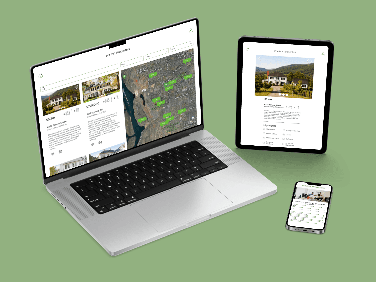
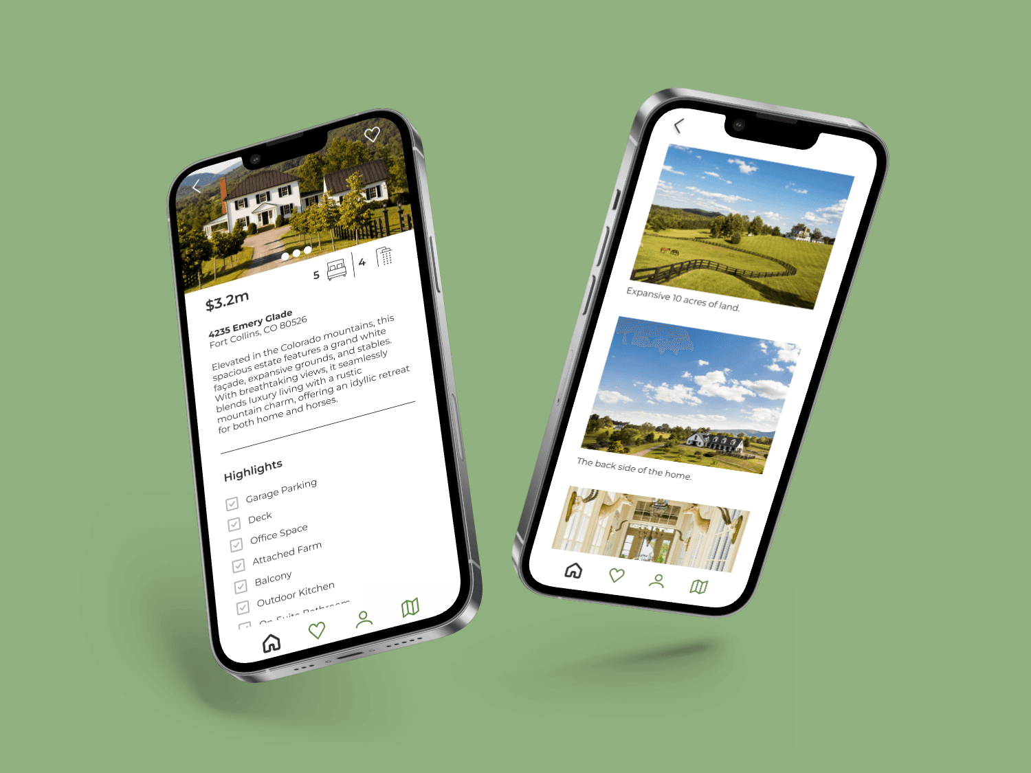
Perfect Properties offers a user-friendly web app with personalized profiles, intuitive search and filtering, comprehensive property information, and seamless contact options, empowering users like Rashida to make informed decisions.
Introduction
Approach
Design
Conclusion
Introduction
Timeline: 8 weeks
Roles: UI Designer
Tools: Figma, Miro, Canva, Photoshop
Join me on the journey of Perfect Properties, where I led as the UI designer crafting an immersive and user-centric experience. This case study showcases my contributions to user research, prototyping, and visual design, resulting in an efficient weather tracking solution.
Conclusion
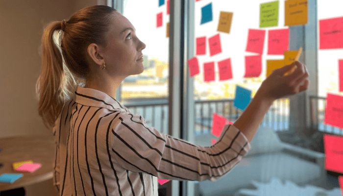
Perfect Properties is rooted in user research, translating insights into an empathetic and aesthetically pleasing design, serving as a reliable platform for real estate investments.
Conclusion
Perfect Properties is rooted in user research, translating insights into an empathetic and aesthetically pleasing design, serving as a reliable platform for real estate investments.

Approach
User persona: Rashida
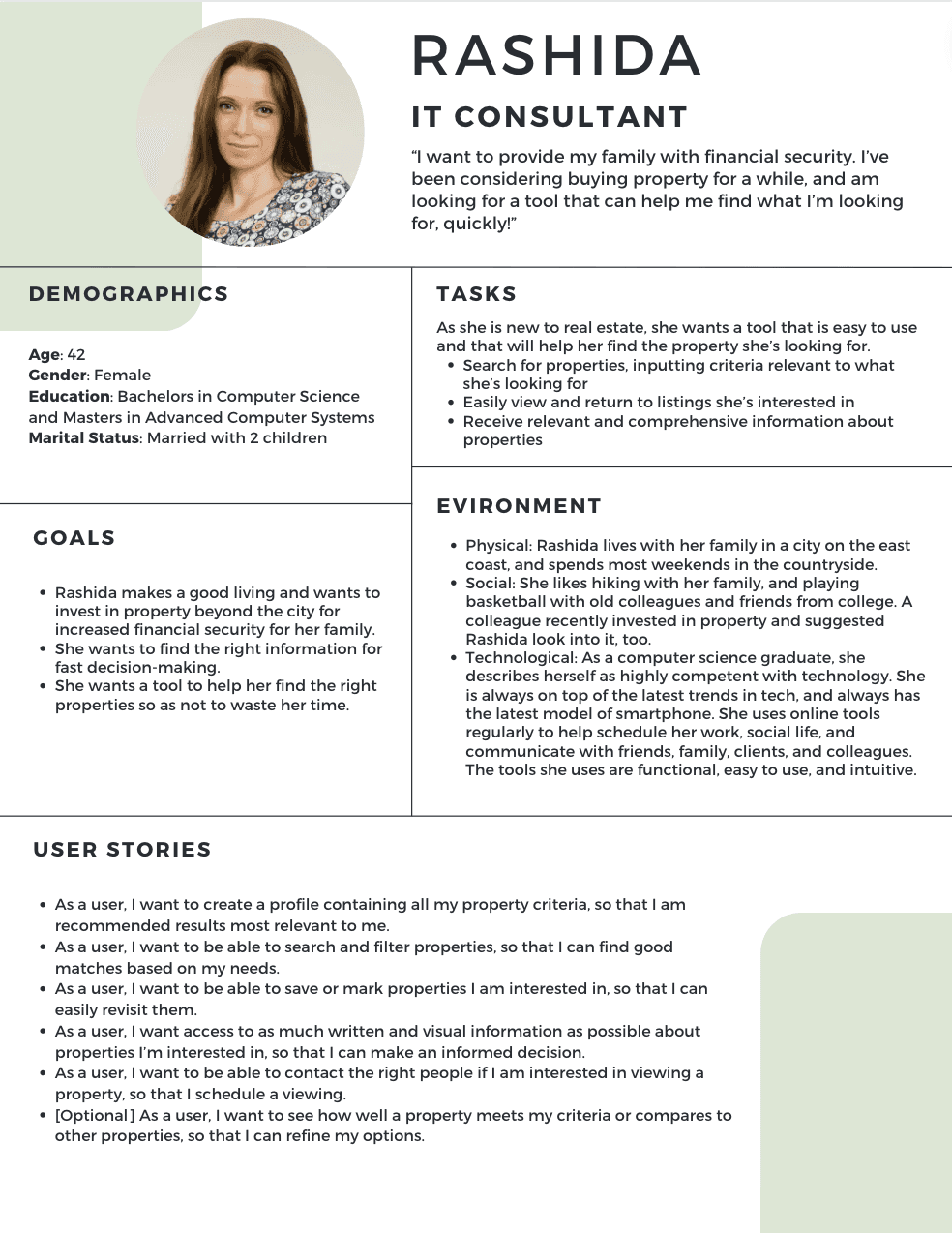
Rashida, a 42-year-old IT consultant, blends tech expertise with family life, seeking a property investment tool aligned with her dynamic lifestyle.
User flows + Scenarios
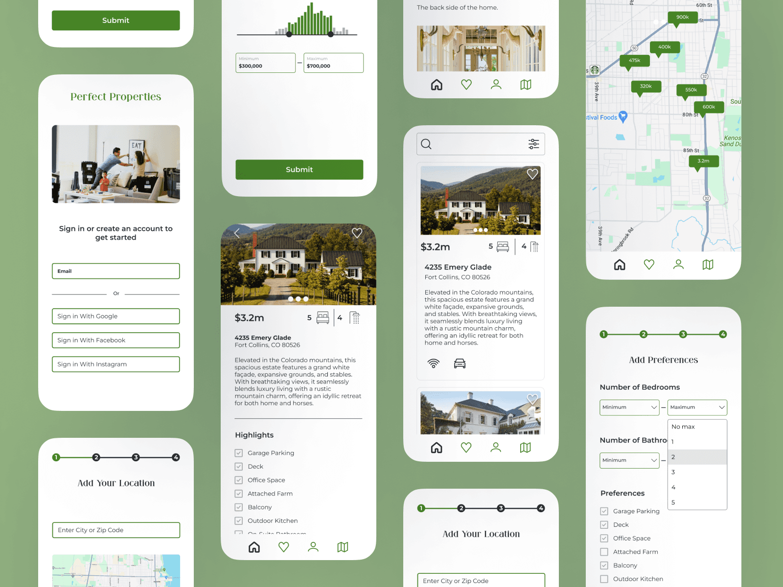
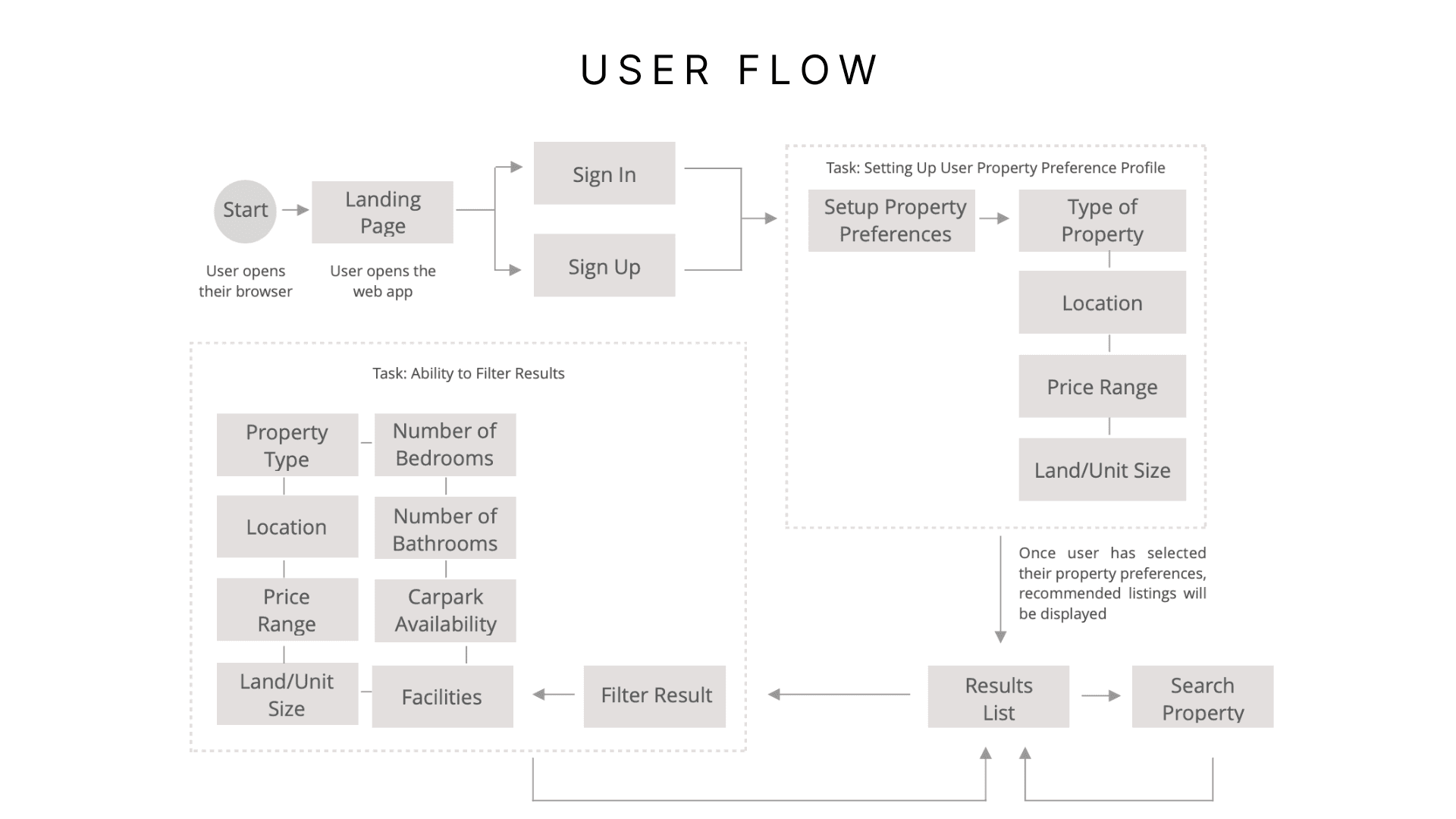
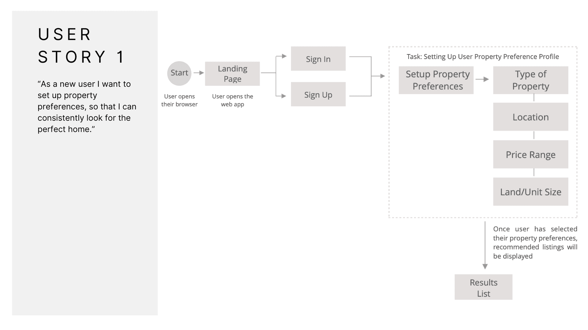
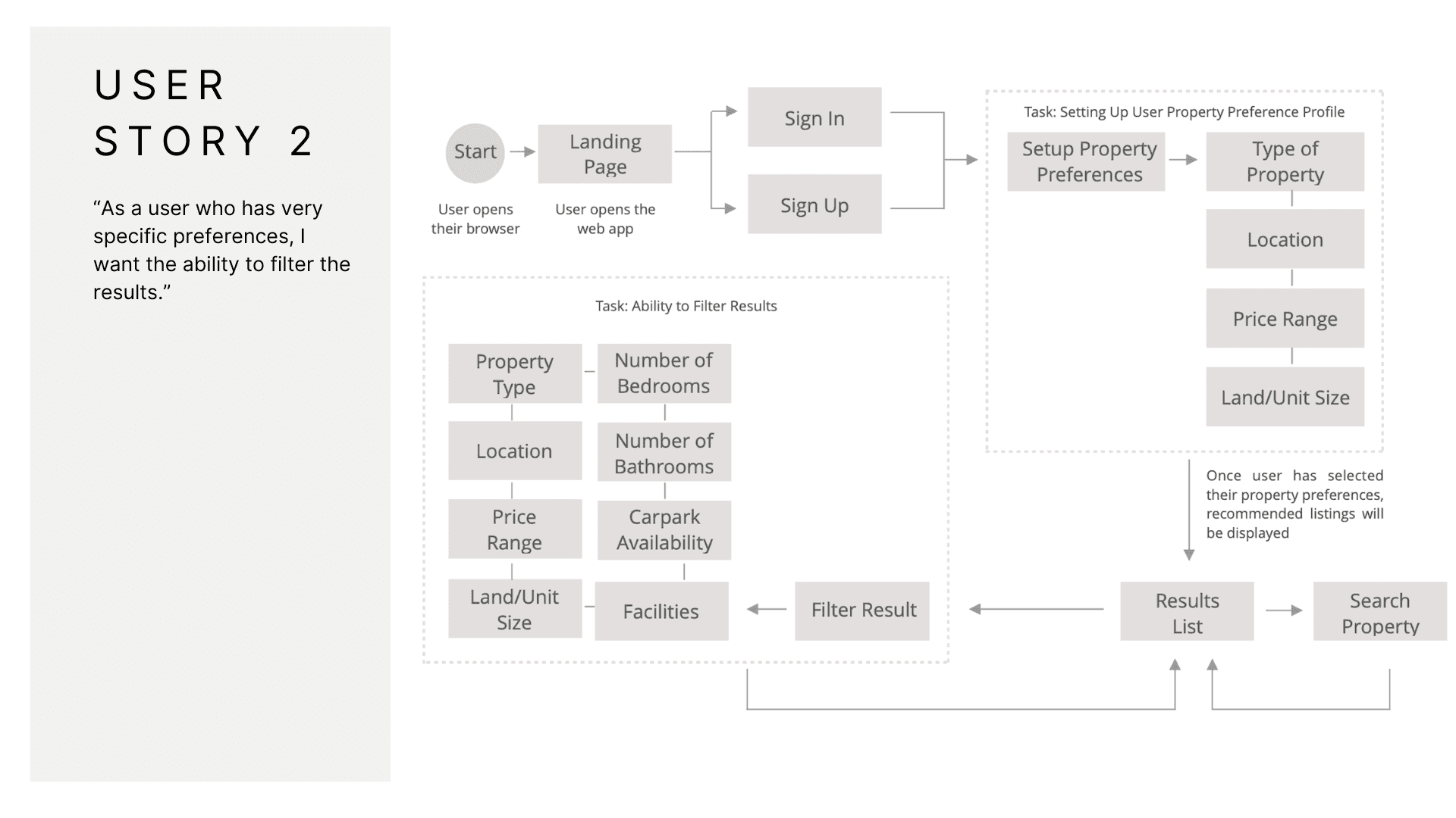
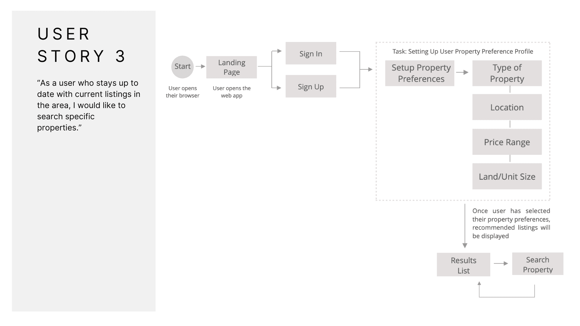
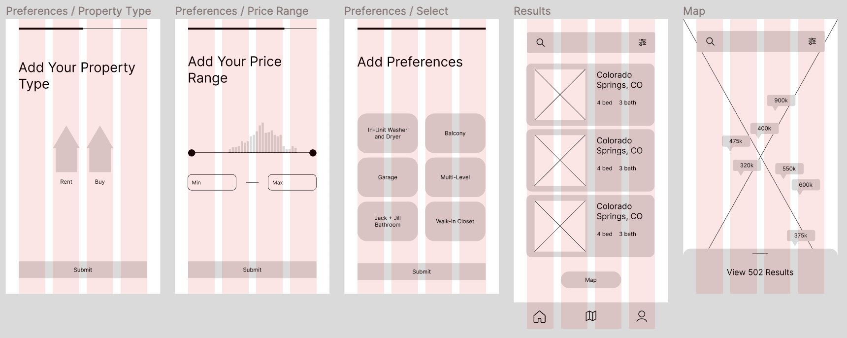
User flows guide the journey from profile creation to property exploration, ensuring intuitive navigation and user-centric decisions.
Ideation
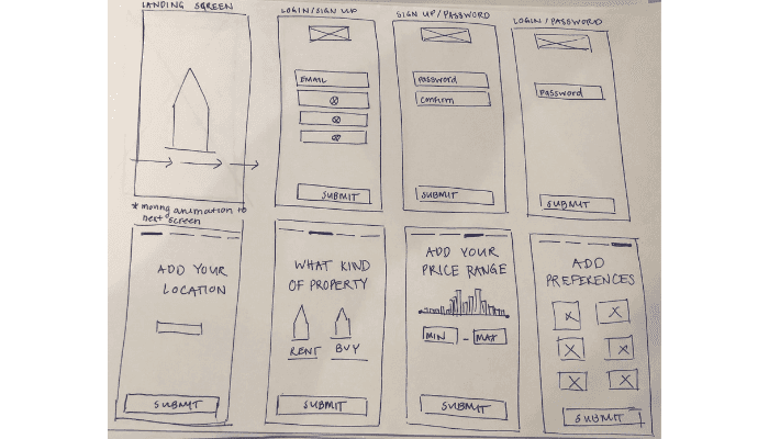
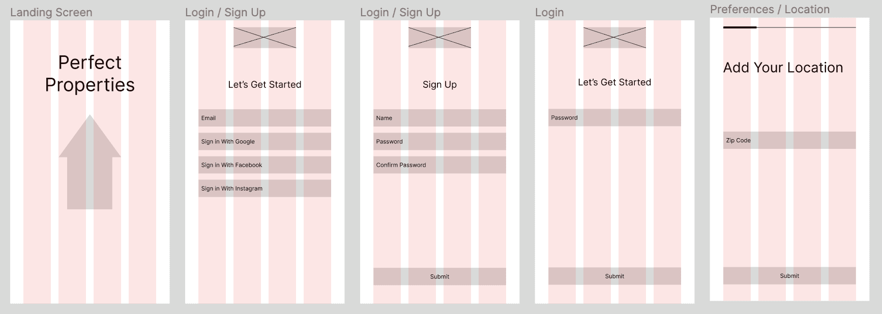
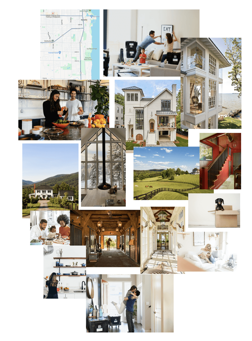
Curated images reflect users' emotions during home-buying, fostering excitement, trustworthiness, and warmth.
Introduction
Timeline: 8 weeks
Roles: UI Designer
Tools: Figma, Miro, Canva, Photoshop
Join me on the journey of Perfect Properties, where I led as the UI designer crafting an immersive and user-centric experience. This case study showcases my contributions to user research, prototyping, and visual design, resulting in an efficient weather tracking solution.

mood boards
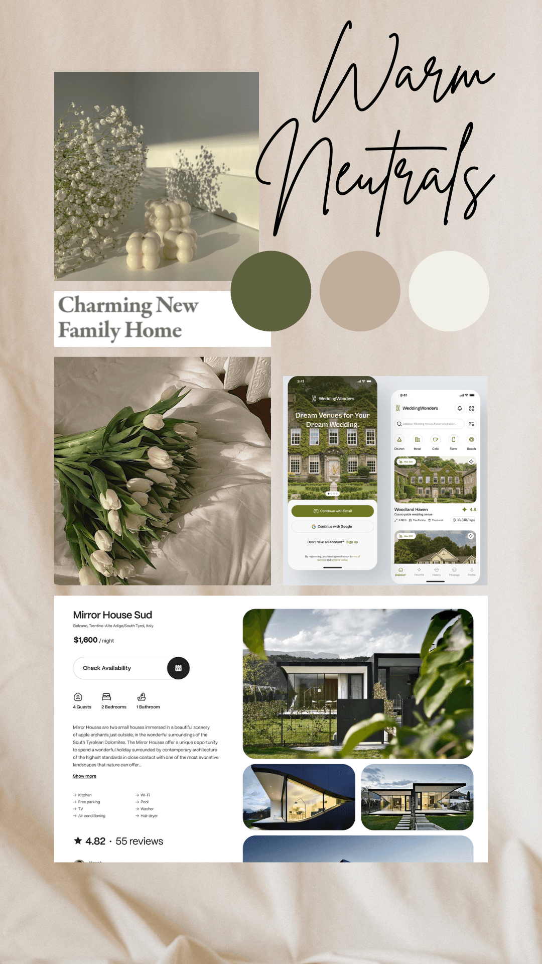
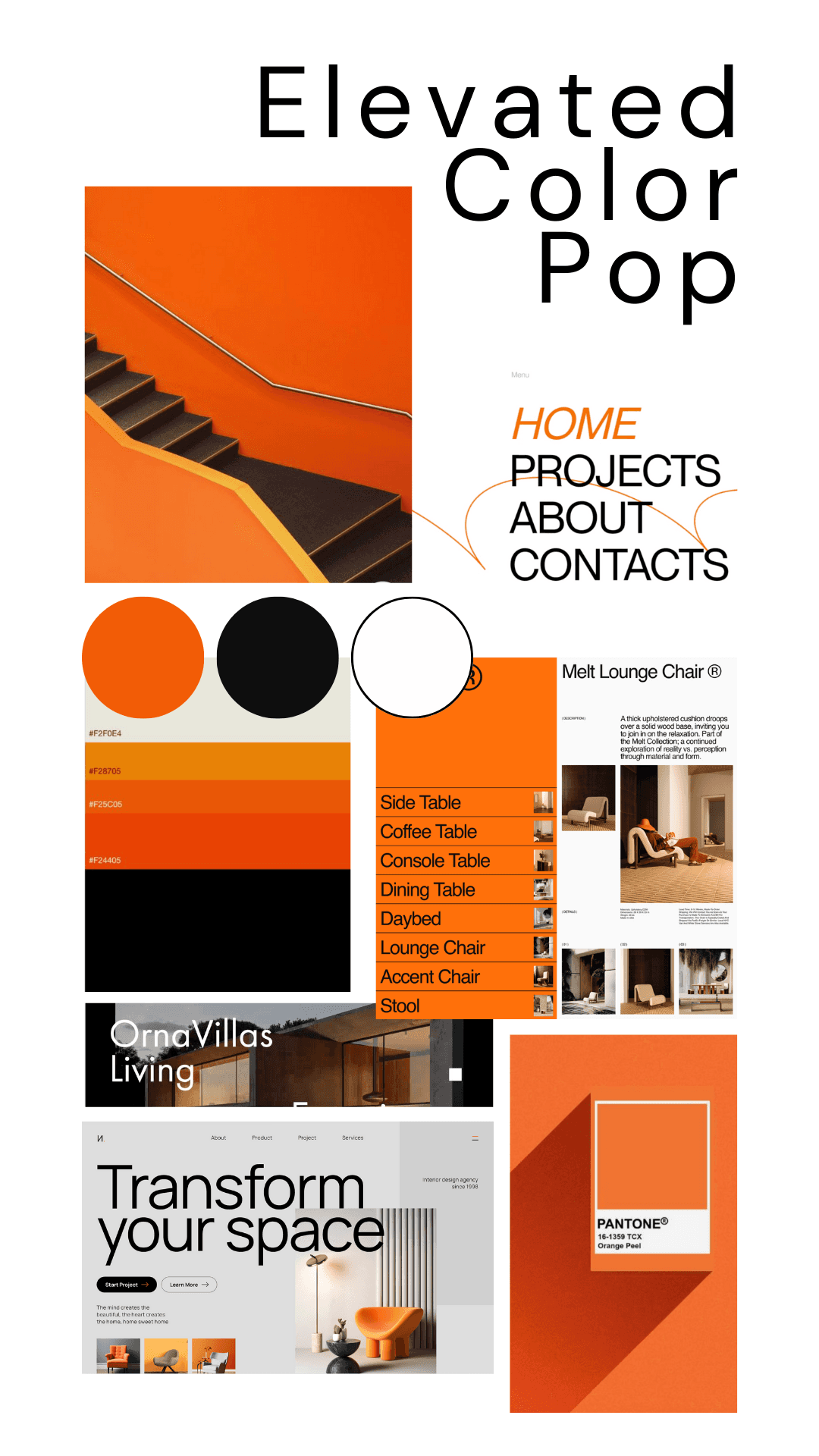
Meticulously crafting two mood boards, I delved into user preferences discovered during initial research:
Warm Neutrals: Eliciting feelings of comfort, welcome, and trust.
Elevated Color Pop: Embracing an artistic, sleek approach with black, white, and vibrant orange accents.
Opting for Warm Neutrals was a personal choice aligned with my understanding of user desires for a clean, trustworthy aesthetic. I envisioned the app as an inviting canvas for properties, resonating with Rashida's needs and preferences.
User flows + Scenarios
User flows guide the journey from profile creation to property exploration, ensuring intuitive navigation and user-centric decisions.


Mood Boards
Meticulously crafting two mood boards, I delved into user preferences discovered during initial research:
Warm Neutrals: Eliciting feelings of comfort, welcome, and trust.
Elevated Color Pop: Embracing an artistic, sleek approach with black, white, and vibrant orange accents.
Opting for Warm Neutrals was a personal choice aligned with my understanding of user desires for a clean, trustworthy aesthetic. I envisioned the app as an inviting canvas for properties, resonating with Rashida's needs and preferences.


Ideation
Curated images reflect users' emotions during home-buying, fostering excitement, trustworthiness, and warmth.


User persona: Rashida
Rashida, a 42-year-old IT consultant, blends tech expertise with family life, seeking a property investment tool aligned with her dynamic lifestyle.

Design
choice of imagery
Carefully curating images reflecting users' emotions during the home-buying process, I included visuals aligned with the discovered need for excitement, trustworthiness, and warmth.

color choice
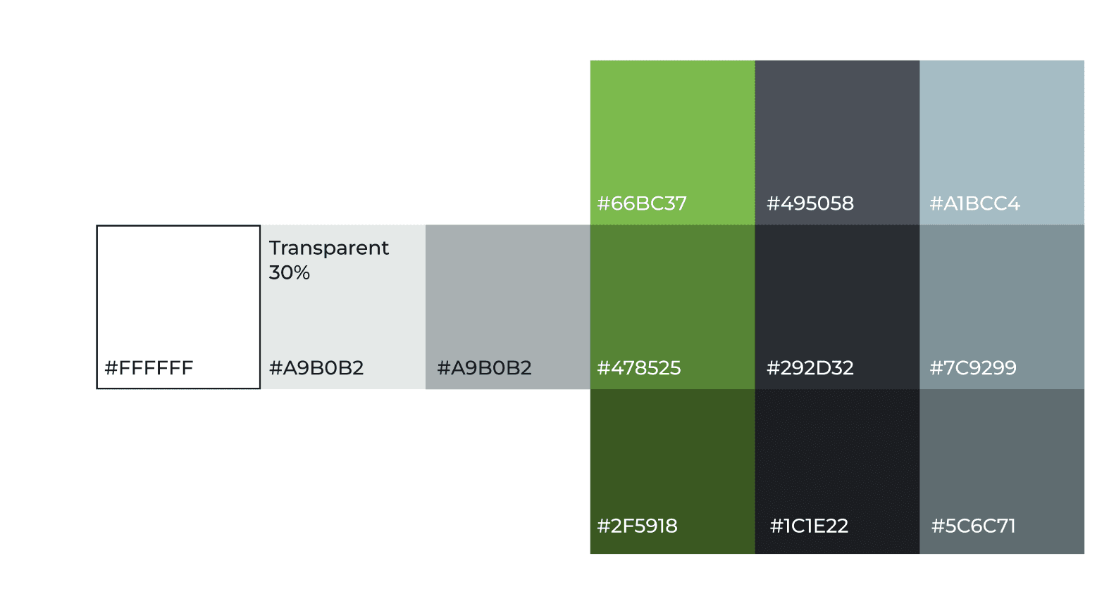
After exploring three color palettes, I chose one featuring green as the primary hue, complemented by secondary blue and an accent of gray. This intentional choice aims to evoke trust and peace, aligning seamlessly with the goal of providing a trustworthy and serene platform for real estate investments. The green hue enhances visual appeal and establishes hierarchy within the design, contributing to a calming user experience.
Icon Set
Redesigned icons ensure consistency and clarity, aligning with brand and user preferences.

Final UI Mockups & Interactive Prototype
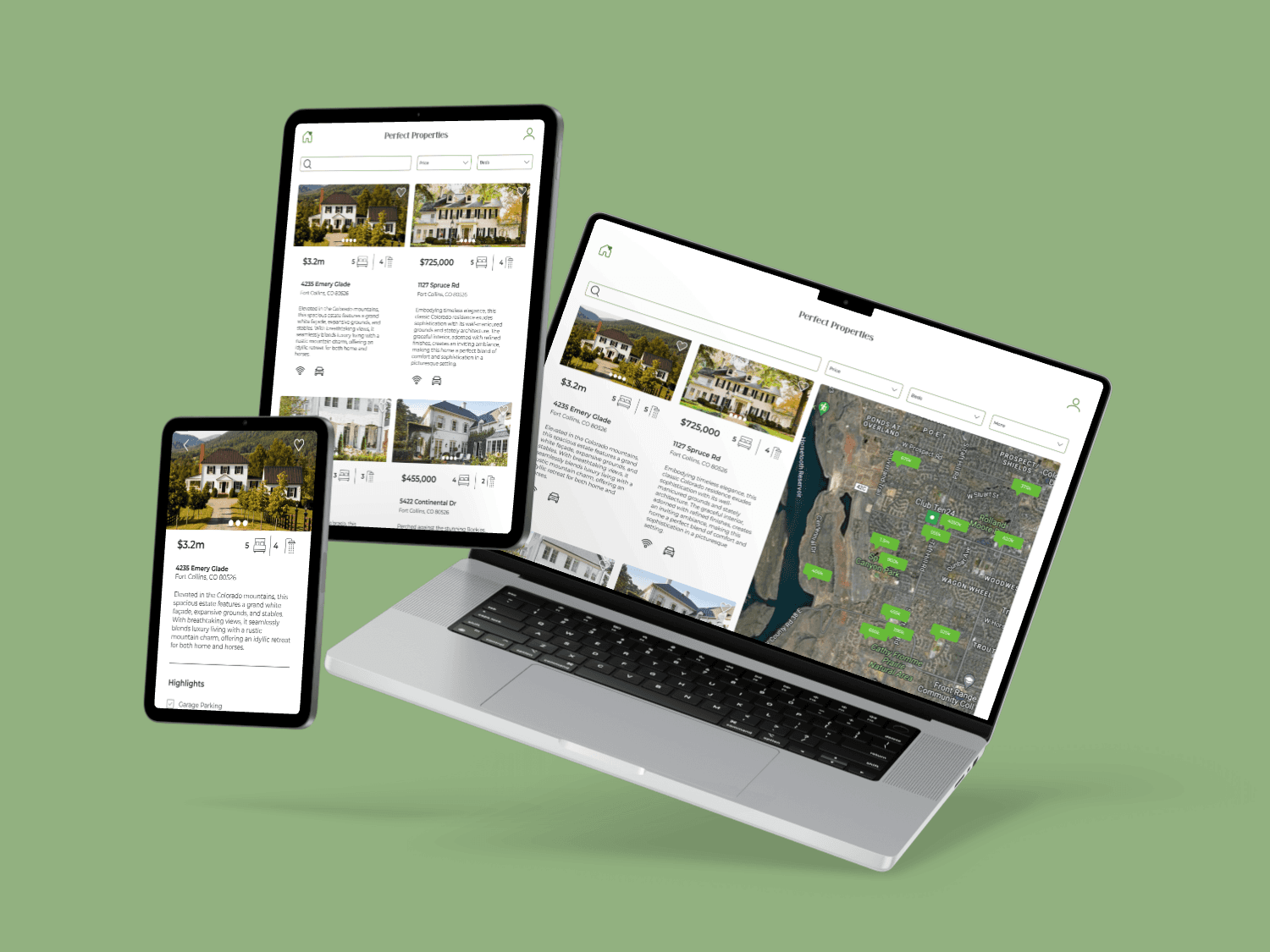
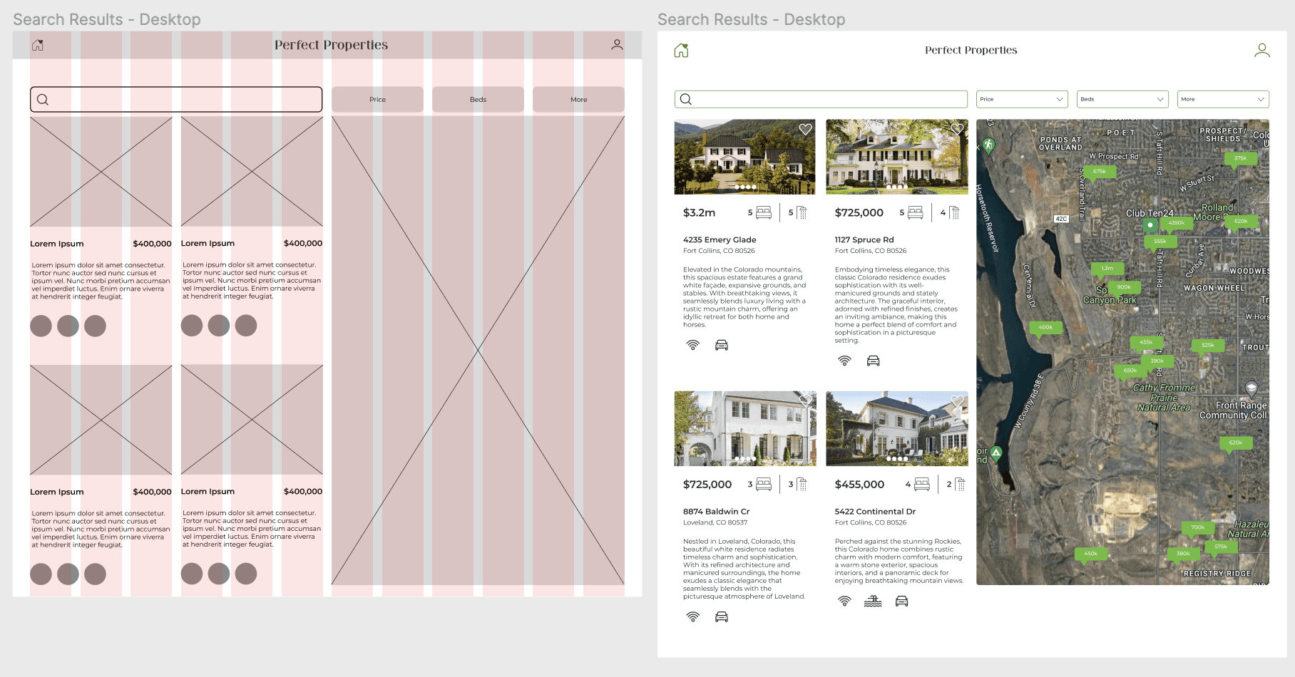
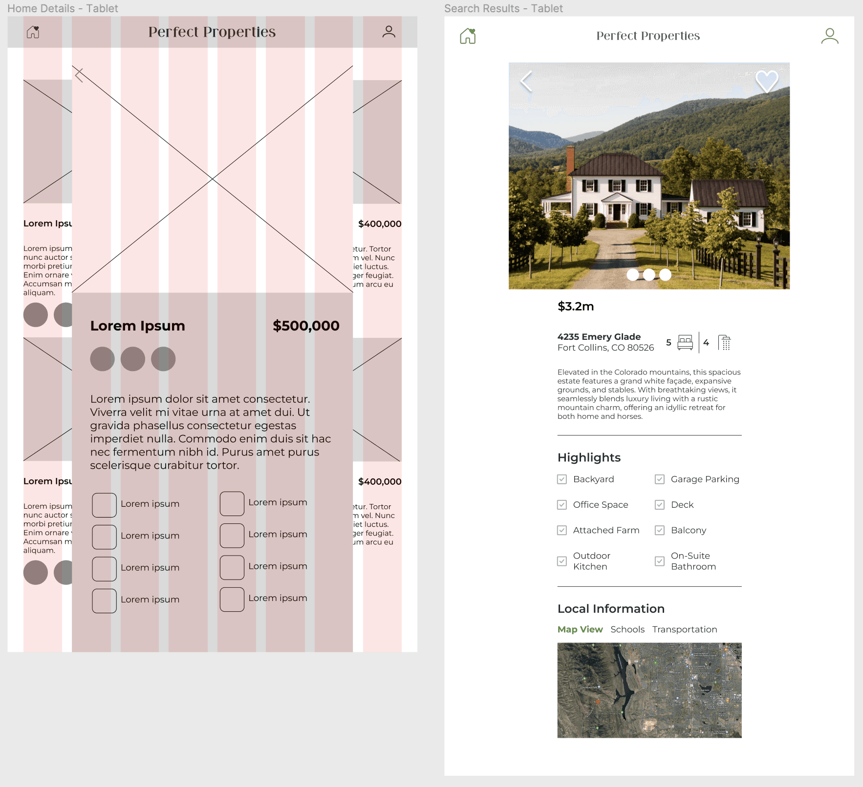
Responsive mockups extend design to tablet and desktop, facilitating a dynamic user experience.
Style Guide
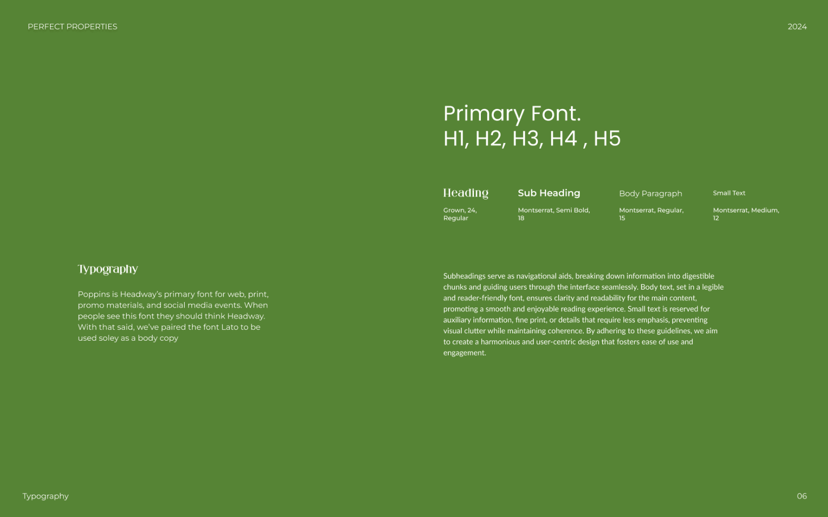
Compiling a comprehensive style guide was a personal endeavor, reflecting users' preferences in color schemes and typography. The detailed handoff package incorporated specifications and guidelines based on my understanding of user feedback.
high-fidelity ui mock ups
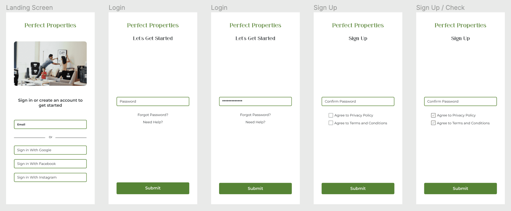
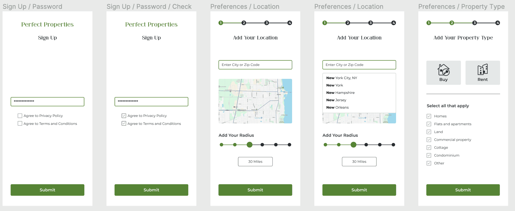
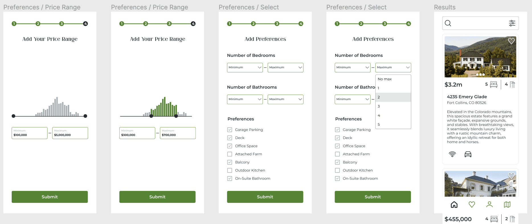
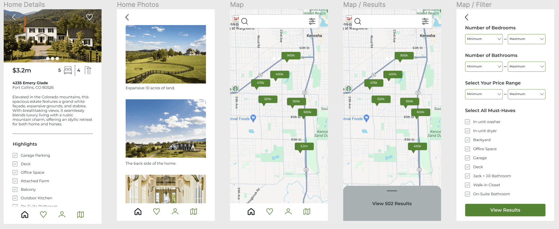
Mobile UI mockups integrate Warm Neutrals mood board and color palette, creating a clean and inviting platform.
Designing for other Breakpoints
Approach
User persona: Rashida
Rashida, a 42-year-old IT consultant, blends tech expertise with family life, seeking a property investment tool aligned with her dynamic lifestyle.

User flows + Scenarios
User flows guide the journey from profile creation to property exploration, ensuring intuitive navigation and user-centric decisions.


Ideation
Curated images reflect users' emotions during home-buying, fostering excitement, trustworthiness, and warmth.


Introduction
Timeline: 8 weeks
Roles: UI Designer
Tools: Figma, Miro, Canva, Photoshop
Join me on the journey of Perfect Properties, where I led as the UI designer crafting an immersive and user-centric experience. This case study showcases my contributions to user research, prototyping, and visual design, resulting in an efficient weather tracking solution.

mood boards
Meticulously crafting two mood boards, I delved into user preferences discovered during initial research:
Warm Neutrals: Eliciting feelings of comfort, welcome, and trust.
Elevated Color Pop: Embracing an artistic, sleek approach with black, white, and vibrant orange accents.
Opting for Warm Neutrals was a personal choice aligned with my understanding of user desires for a clean, trustworthy aesthetic. I envisioned the app as an inviting canvas for properties, resonating with Rashida's needs and preferences.


User flows + Scenarios
User flows guide the journey from profile creation to property exploration, ensuring intuitive navigation and user-centric decisions.


Mood Boards
Meticulously crafting two mood boards, I delved into user preferences discovered during initial research:
Warm Neutrals: Eliciting feelings of comfort, welcome, and trust.
Elevated Color Pop: Embracing an artistic, sleek approach with black, white, and vibrant orange accents.
Opting for Warm Neutrals was a personal choice aligned with my understanding of user desires for a clean, trustworthy aesthetic. I envisioned the app as an inviting canvas for properties, resonating with Rashida's needs and preferences.


Ideation
Curated images reflect users' emotions during home-buying, fostering excitement, trustworthiness, and warmth.


User persona: Rashida
Rashida, a 42-year-old IT consultant, blends tech expertise with family life, seeking a property investment tool aligned with her dynamic lifestyle.

Design
choice of imagery
Carefully curating images reflecting users' emotions during the home-buying process, I included visuals aligned with the discovered need for excitement, trustworthiness, and warmth.

color choice
After exploring three color palettes, I chose one featuring green as the primary hue, complemented by secondary blue and an accent of gray. This intentional choice aims to evoke trust and peace, aligning seamlessly with the goal of providing a trustworthy and serene platform for real estate investments. The green hue enhances visual appeal and establishes hierarchy within the design, contributing to a calming user experience.

Icon Set
Redesigned icons ensure consistency and clarity, aligning with brand and user preferences.

Final UI Mockups & Interactive Prototype
Responsive mockups extend design to tablet and desktop, facilitating a dynamic user experience.
Style Guide
Compiling a comprehensive style guide was a personal endeavor, reflecting users' preferences in color schemes and typography. The detailed handoff package incorporated specifications and guidelines based on my understanding of user feedback.

high-fidelity ui mock ups
Mobile UI mockups integrate Warm Neutrals mood board and color palette, creating a clean and inviting platform.


Designing for other Breakpoints


Approach
User persona: Rashida
Rashida, a 42-year-old IT consultant, blends tech expertise with family life, seeking a property investment tool aligned with her dynamic lifestyle.

User flows + Scenarios
User flows guide the journey from profile creation to property exploration, ensuring intuitive navigation and user-centric decisions.


Ideation
Curated images reflect users' emotions during home-buying, fostering excitement, trustworthiness, and warmth.


Introduction
Timeline: 8 weeks
Roles: UI Designer
Tools: Figma, Miro, Canva, Photoshop
Join me on the journey of Perfect Properties, where I led as the UI designer crafting an immersive and user-centric experience. This case study showcases my contributions to user research, prototyping, and visual design, resulting in an efficient weather tracking solution.

mood boards
Meticulously crafting two mood boards, I delved into user preferences discovered during initial research:
Warm Neutrals: Eliciting feelings of comfort, welcome, and trust.
Elevated Color Pop: Embracing an artistic, sleek approach with black, white, and vibrant orange accents.
Opting for Warm Neutrals was a personal choice aligned with my understanding of user desires for a clean, trustworthy aesthetic. I envisioned the app as an inviting canvas for properties, resonating with Rashida's needs and preferences.


User flows + Scenarios
User flows guide the journey from profile creation to property exploration, ensuring intuitive navigation and user-centric decisions.


Mood Boards
Meticulously crafting two mood boards, I delved into user preferences discovered during initial research:
Warm Neutrals: Eliciting feelings of comfort, welcome, and trust.
Elevated Color Pop: Embracing an artistic, sleek approach with black, white, and vibrant orange accents.
Opting for Warm Neutrals was a personal choice aligned with my understanding of user desires for a clean, trustworthy aesthetic. I envisioned the app as an inviting canvas for properties, resonating with Rashida's needs and preferences.


Ideation
Curated images reflect users' emotions during home-buying, fostering excitement, trustworthiness, and warmth.


User persona: Rashida
Rashida, a 42-year-old IT consultant, blends tech expertise with family life, seeking a property investment tool aligned with her dynamic lifestyle.

Design
choice of imagery
Carefully curating images reflecting users' emotions during the home-buying process, I included visuals aligned with the discovered need for excitement, trustworthiness, and warmth.

color choice
After exploring three color palettes, I chose one featuring green as the primary hue, complemented by secondary blue and an accent of gray. This intentional choice aims to evoke trust and peace, aligning seamlessly with the goal of providing a trustworthy and serene platform for real estate investments. The green hue enhances visual appeal and establishes hierarchy within the design, contributing to a calming user experience.

Icon Set
Redesigned icons ensure consistency and clarity, aligning with brand and user preferences.

Final UI Mockups & Interactive Prototype
Responsive mockups extend design to tablet and desktop, facilitating a dynamic user experience.
Style Guide
Compiling a comprehensive style guide was a personal endeavor, reflecting users' preferences in color schemes and typography. The detailed handoff package incorporated specifications and guidelines based on my understanding of user feedback.

high-fidelity ui mock ups
Mobile UI mockups integrate Warm Neutrals mood board and color palette, creating a clean and inviting platform.


Designing for other Breakpoints


Approach
User persona: Rashida
Rashida, a 42-year-old IT consultant, blends tech expertise with family life, seeking a property investment tool aligned with her dynamic lifestyle.

User flows + Scenarios
User flows guide the journey from profile creation to property exploration, ensuring intuitive navigation and user-centric decisions.


Ideation
Curated images reflect users' emotions during home-buying, fostering excitement, trustworthiness, and warmth.


Introduction
Timeline: 8 weeks
Roles: UI Designer
Tools: Figma, Miro, Canva, Photoshop
Join me on the journey of Perfect Properties, where I led as the UI designer crafting an immersive and user-centric experience. This case study showcases my contributions to user research, prototyping, and visual design, resulting in an efficient weather tracking solution.

mood boards
Meticulously crafting two mood boards, I delved into user preferences discovered during initial research:
Warm Neutrals: Eliciting feelings of comfort, welcome, and trust.
Elevated Color Pop: Embracing an artistic, sleek approach with black, white, and vibrant orange accents.
Opting for Warm Neutrals was a personal choice aligned with my understanding of user desires for a clean, trustworthy aesthetic. I envisioned the app as an inviting canvas for properties, resonating with Rashida's needs and preferences.


User flows + Scenarios
User flows guide the journey from profile creation to property exploration, ensuring intuitive navigation and user-centric decisions.


Mood Boards
Meticulously crafting two mood boards, I delved into user preferences discovered during initial research:
Warm Neutrals: Eliciting feelings of comfort, welcome, and trust.
Elevated Color Pop: Embracing an artistic, sleek approach with black, white, and vibrant orange accents.
Opting for Warm Neutrals was a personal choice aligned with my understanding of user desires for a clean, trustworthy aesthetic. I envisioned the app as an inviting canvas for properties, resonating with Rashida's needs and preferences.


Ideation
Curated images reflect users' emotions during home-buying, fostering excitement, trustworthiness, and warmth.


User persona: Rashida
Rashida, a 42-year-old IT consultant, blends tech expertise with family life, seeking a property investment tool aligned with her dynamic lifestyle.

Design
choice of imagery
Carefully curating images reflecting users' emotions during the home-buying process, I included visuals aligned with the discovered need for excitement, trustworthiness, and warmth.

color choice
After exploring three color palettes, I chose one featuring green as the primary hue, complemented by secondary blue and an accent of gray. This intentional choice aims to evoke trust and peace, aligning seamlessly with the goal of providing a trustworthy and serene platform for real estate investments. The green hue enhances visual appeal and establishes hierarchy within the design, contributing to a calming user experience.

Icon Set
Redesigned icons ensure consistency and clarity, aligning with brand and user preferences.

Final UI Mockups & Interactive Prototype
Responsive mockups extend design to tablet and desktop, facilitating a dynamic user experience.
Style Guide
Compiling a comprehensive style guide was a personal endeavor, reflecting users' preferences in color schemes and typography. The detailed handoff package incorporated specifications and guidelines based on my understanding of user feedback.

high-fidelity ui mock ups
Mobile UI mockups integrate Warm Neutrals mood board and color palette, creating a clean and inviting platform.


Designing for other Breakpoints


Key Takeaways
Strategic color choices, informed by color psychology, profoundly influence user trust and reliability, shaping future design endeavors.
Key Takeaways
Strategic color choices, informed by color psychology, profoundly influence user trust and reliability, shaping future design endeavors.
Design
Choice of imagery
Carefully curating images reflecting users' emotions during the home-buying process, I included visuals aligned with the discovered need for excitement, trustworthiness, and warmth.
Design
Choice of imagery
Carefully curating images reflecting users' emotions during the home-buying process, I included visuals aligned with the discovered need for excitement, trustworthiness, and warmth.

Design
Choice of imagery
Carefully curating images reflecting users' emotions during the home-buying process, I included visuals aligned with the discovered need for excitement, trustworthiness, and warmth.

Color Choice
After exploring three color palettes, I chose one featuring green as the primary hue, complemented by secondary blue and an accent of gray. This intentional choice aims to evoke trust and peace, aligning seamlessly with the goal of providing a trustworthy and serene platform for real estate investments. The green hue enhances visual appeal and establishes hierarchy within the design, contributing to a calming user experience.

icon set
Redesigned icons ensure consistency and clarity, aligning with brand and user preferences.

icon set
Redesigned icons ensure consistency and clarity, aligning with brand and user preferences.

icon set
Redesigned icons ensure consistency and clarity, aligning with brand and user preferences.

high-fidelity ui mock ups
Mobile UI mockups integrate Warm Neutrals mood board and color palette, creating a clean and inviting platform.


Designing for other Breakpoints


high-fidelity ui mock ups
Mobile UI mockups integrate Warm Neutrals mood board and color palette, creating a clean and inviting platform.


Designing for other Breakpoints


high-fidelity ui mock ups
Mobile UI mockups integrate Warm Neutrals mood board and color palette, creating a clean and inviting platform.


Designing for other Breakpoints


Final UI Mockups & Interactive Prototype
Responsive mockups extend design to tablet and desktop, facilitating a dynamic user experience.
Final UI Mockups & Interactive Prototype
Responsive mockups extend design to tablet and desktop, facilitating a dynamic user experience.
Final UI Mockups & Interactive Prototype
Responsive mockups extend design to tablet and desktop, facilitating a dynamic user experience.
Style Guide
Compiling a comprehensive style guide was a personal endeavor, reflecting users' preferences in color schemes and typography. The detailed handoff package incorporated specifications and guidelines based on my understanding of user feedback.

Style Guide
Compiling a comprehensive style guide was a personal endeavor, reflecting users' preferences in color schemes and typography. The detailed handoff package incorporated specifications and guidelines based on my understanding of user feedback.

Style Guide
Compiling a comprehensive style guide was a personal endeavor, reflecting users' preferences in color schemes and typography. The detailed handoff package incorporated specifications and guidelines based on my understanding of user feedback.

conclusion
Perfect Properties is rooted in user research, translating insights into an empathetic and aesthetically pleasing design, serving as a reliable platform for real estate investments.
conclusion
Perfect Properties is rooted in user research, translating insights into an empathetic and aesthetically pleasing design, serving as a reliable platform for real estate investments.
conclusion
Perfect Properties is rooted in user research, translating insights into an empathetic and aesthetically pleasing design, serving as a reliable platform for real estate investments.

Key Takeaways
Strategic color choices, informed by color psychology, profoundly influence user trust and reliability, shaping future design endeavors.
Key Takeaways
Strategic color choices, informed by color psychology, profoundly influence user trust and reliability, shaping future design endeavors.
Key Takeaways
Strategic color choices, informed by color psychology, profoundly influence user trust and reliability, shaping future design endeavors.
